In today's digital marketing space that keeps moving at a rapid pace, landing pages design carries more weight than ever before. You might optimize the SEO, perform A/B testing, improve your link-building strategy. Still, improving your landing pages that grab your leads' attention doesn't stop there.
The customers' experience and habits are continually changing. Now, it only takes a split second for a potential customer to decide whether or not they'll spend time on your page and convert.
They become harder to please as they know they can quickly obtain similar products or services on the internet. This is why you must ensure your landing page is up-to-date and get them to submit their information.
Having old, outdated pages that require answering long forms will scare away visitors. They are now more vigilant with the fear of losing their personal information and privacy. Redesigning your landing page is now welcomed and encouraged than before.
Table of Contents
Why is a Landing Page Redesign Necessary For Every business?
You know your landing pages are in good shape if it can target a specific audience, resonate with their personas, and increase conversions. It means that conversions lead to prospects, prospects into customers, and customers into other customers. That's how you keep the business running, isn't it?
Considering that your landing pages are one of your most essential salespeople, it's crucial to keep it relevant in this ever-growing marketplace.
Here, redesigning doesn't necessarily mean that you have to change every single element of your landing pages completely. It can just entail making functional adjustments, so your landing pages are doing its job to the best of its ability.
If you're still on the fence about investing in landing pages redesign, here are the top 3 essential reasons it's time to give your landing pages a “fresher” look:
Create a Better User Experience
User experience (UX) is supposed to provide positive experiences that keep visitors loyal to your brand and company. It deals with your visitors' emotional experience when navigating through your landing page and how it aligns with their intentions.
A better UX makes it easier for visitors to navigate through your landing page. On the other hand, a landing page with a puzzling, awful UX can hurt your business far more than not having one at all. Your page represents your company and will give the visitors' perception of your credibility.
In this matter, redesigning your landing pages anticipates the visitors' pain points and continually provides a solution.
Realign Your Business Objectives and Digital Strategy
Keep in mind that just the same way as the digital sphere isn't static and keeps evolving, so does your digital marketing strategy. It will need to grow and be redefined not only because of your customers but also because your competitors are trying different, innovative development.
You need to be relentless about whether your digital marketing strategy is still relevant and growth inspiring in achieving your business adjectives. Keeping your landing pages updated helps you to ensure that the strategy is working effectively towards your specific goals (i.e., increased sales, drive more traffic, etc.).
Optimize The Buyer Journey on Your Website
Remember that your landing pages are a crucial player in your sales team?
Redesigning it means that you continuously upgrade the efforts to make your selling process superfluous. If you market your brand with the same messaging and materials on the landing page, the conversion rates will suffer.
A well-thought-out landing page creates a positive impression for your visitors. It convinces them to get to know your brand and consider the features before they decide to make a purchase. That's to say, compelling landing pages encourage the visitors along the buyer's journey and keep them moving through your sales funnel.
When's the Right Time to Redesign Landing Pages?
One of the most noticeable signs that you need a redesign is the low conversion rates, or your page is not converting at all. More often than not, most would shrug it off and tell themselves it's because it's right after the holiday season.
But behind every low conversion rate, you may have overlooked parts where it's making your leads stray away.
Check out this five often-overlooked signs and see if it's time to redesign your landing pages:
#1. It's Not Mobile-friendly and Hard to Navigate
In this era of immediacy, your potential customers are always on the go. They're most likely to access the internet through their mobile devices, including making purchases.
So it comes as no surprise that mobile devices now drive over 52% of global internet traffic and account for 2 out of 3 minutes users spent online. Not to mention that there are at least 3.9 billion active mobile internet users worldwide.
If you still have the standard website landing pages that are designed for desktop viewing, most of your potential customers will find it challenging to navigate. Chances are it'll make a negative impression and encourage them to move on to your competitors’ page that offers a better mobile experience.
That's how you miss out on valuable leads and customers.
Plain and simple; you need to make your landing pages satisfy mobile-first behavior. Your landing pages need to be customized for each device type that's used throughout the customer's journey.

#2. It’s Too Copy heavy, Not Enough Visuals
You know the old saying, “a picture is worth a thousand words” or “a video is worth a million words”? That applies to your landing pages design as well.
Your visitors only remember 20% of what they read, while recognizing 80% of what they see. So it's not that surprising that landing pages with less text content have an average conversion rate of 14%, while pages with too much text convert on average at 11%.
The abundance of texts makes your landing pages way too much of a chore to read for your visitors since it appears cluttered and hard to skim. This is why integrating visuals to your landing pages not only helps attract the visitors, but it also enables you to make a lasting impression.
Look what a copy-heavy landing page looks like:

In the example above, you can tell that providing too much text and information can overwhelm or even intimidate your visitors. The page makes it too complex to scroll and hard to understand.
So it's safe to say that a high-converting landing page combines the power of text and visuals to prompt users to proceed through the buyer journey.
If you still have landing pages with large blocks of text, now’s the time to redesign it.
#3. It Doesn’t Resonate with Your Target Customers
Most old-style landing pages are too focused on leading the visitors to buy the product without giving them much detail about how it works and why they need it.
High-converting landing pages tell a cohesive, relatable story that resonates meaningfully to your target customers and makes them feel understood.
Your visitors are waiting to hear from you. Right after they land on your page, they're ready to be convinced. That's why you need to directly address their pain points and use persuasive words to describe their problems.
Developing landing pages that resonate with your target customers is 2-5 times more effective in engaging visitors. It means that it gives you higher chances to encourage them to convert.
Now, it's time to check your landing pages' headlines. Does it address problems that your potential customers experience?
Next, check your copy. Is it what your target audience would like to know about your brand?
If your answers are mostly no, then you might want to reconsider those landing pages.
#4. It Has Too Many CTA buttons
You might be thinking, “more options mean more conversion, right?” So, you put a lot of CTAs on your landing page, hoping that the visitors at least click on one of them.
But that's not how it works.
Putting too many CTAs on your landing page (with the same design) hides your primary selling point, that's a real conversion killer. Just take it from this example:

From the example above, you can see that the visitors are asked to view the demo, get pricing, and contact sales. It's too vague and unclear what the conversion goal of the page actually is.
Remember, your landing page has one job: giving your visitors what they were promised in other sites or ads that got them there. And one thing you can expect most from them is to convert. So you must make it easy for them to do that.
Look how Astrogrowth seamlessly narrows down the visitors' choice by highlighting the main CTA.

On their page, you can either look through a software review or join the email subscription. However, this option is more emphasized with the red button: “Join 3,417+ Entrepreneurs Today.” Now you can tell that the color difference makes the primary CTA evident that this is the action that Astrogrowth wants its visitors to take.
Offering them with one prominent CTA button makes it easier for you to lead visitors to complete a specific goal. Asking visitors to complete multiple actions could lose you a potential lead in seconds.
#5. Its Load Times Are Annoyingly Slow
In an age of instant gratification, it's no longer optional for you to have slow websites and slow landing pages.
At least 70% of potential customers say that page speed influences their purchasing decision. If your landing pages take more than three seconds to load, don't be surprised if more than half of your visitors (56%) will leave it.
So, for every second of impatient agony you give your visitors with slow load times lead to a conversion rate drop. Besides, the fast-loading pages prompt visitors to take action.
You must've noticed that your visitors are most likely fickle — they're just one click away from hitting your competitors' site. So if you give them a chance to wander away from the page, that's precisely what they'll do.
There are many tools that can help you to check your page load times, such as Google's PageSpeed Insights. These tools make it easier for you to get a sense of how quickly your landing pages are loading on desktop and mobile devices. The more your landing pages get closer to 100, the faster it loads.
Redesigning Landing Pages for Small Businesses
Redesigning landing pages aren't the easiest and the cheapest task to do. For small business owners like you, it might be daunting and overwhelming.
While it may seem like you're fighting an uphill battle, creating up-to-date landing pages can help your small business to compete on a grander scale and stay ahead of the competition.
Hence, we could write a full textbook on how to optimize landing pages redesigning for small businesses. But, these four low-hanging fruit of practices are noteworthy enough to sum it all up:
Benefit-focused headlines and subheadings
More than 80% of your visitors will read nothing more than your headline before they're losing interest. Hence, your landing page headline is often visitors' first impression of you and your brand. And as a small business owner, making a strong first impression is one of the best ways to be remembered.
Look at how Astrogrowth does an excellent job of creating appealing headlines and subheadings by highlighting how its product benefits and helps the visitors:

Lead Capture Form that Converts
The form is necessary for lead generation as they're the last stop before the conversion. Creating a lead form is such a piece of cake, but creating a high-converting one can be tricky– especially for small businesses.
So, one thing you need to get this right is: only ask what you need to know. Avoid to include unnecessary form fields considering some of your visitors feel insecure sharing their details, while some others feel like it's just too much effort for little return.
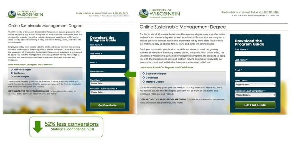
Take a look at the example from the University of Wisconsin-Extension below:

The form which includes a requirement for phone number on a given signup form field (left picture) was lowering the conversion rates by 52%. After they redesigned it by removing the phone number requirement on the form (right picture), the conversion rates have successfully increased by at least 68%.
Remove All Navigation Links
Remember that too many CTA buttons can distract your visitors instead of gaining more conversions? Adding more links on your landing page also doesn't make it easy for visitors to complete the conversion goal.
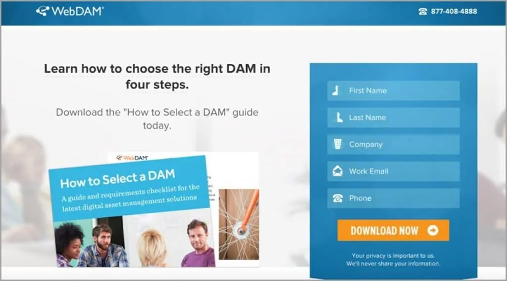
To get more insights, here's an example from WebDAM:

WebDAM hits the right notes in simplifying their Adwords landing page. They removed the top navigations in favor of a logo link to their homepage and a service number to call. It convinces the visitors to do the main call-to-action of the page–- download the instructions.
It's crucial for your small business to funnel visitors down a desired pathway so you can complete a certain goal. That's why you need to limit your exit points (such as hyperlinks) on your landing pages.
Create a “Thank You” Page
As you might already be aware, thank you page is where your visitors are redirected to after they fill out a form on your landing page. It might sound like a no-brainer, but thank you page plays a significant role in the success of your next marketing efforts.
You can also send a post-event thank you along with the next steps that your customers should follow, just like this example:

As you look at the example above, you'll realize that a thank-you page can be a goldmine of your post-conversion strategy.
With a thank you page, you can keep your customers engaged with your brand. It helps you to let the customers know that their purchase has succeeded. That way, you can strengthen your relationship with your customers.
Is It Time to Redesign Your Landing Page?
Landing pages are the bare-bones of sales pages with one goal: to move your website visitors down the sales funnel. And redesigning it is indeed not a small task or investment, but the results will be well worth any bumps in the road you face early on.
In this ever-growing digital marketplace, your landing pages are the main storefront and a key player in your lead generation efforts. By all means, keeping it up-to-date and fresh is a cornerstone of your entire digital marketing strategy.


